Corporate Identity
CI of KAI visualizes cutting-edge industry energetically soaring
to the future and pioneering a better tomorrow.

-
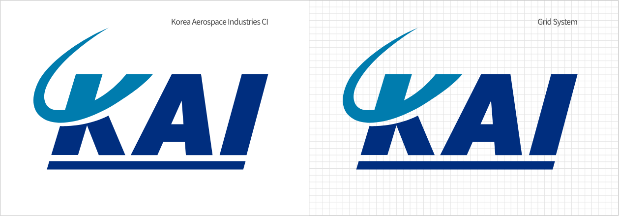
- Corporate symbol mark (Wordmark) is a symbol representing the visual imagery of Korea Aerospace industries and possesses the core element in Corporate Identity Program (CIP)
- Internally, forms a sense of belonging and uniformity among KAI constituents; externally, plays a crucial role in conveying consistent visual image of KAI. KAI wordmark came to existence by combining first letters of ‘KOREA AEROSPACE INDUSTRIES,LTD.’
- Keeping in pace with Internationalization and Globalization, upper portion of the English initial “K” is shaped to resemble the universe in an attempt to express KAI within the world, KAI bridging the world and KAI into entire space world industry.
- KAI is illustrated in italic to suggest speed and direction befitting to aerospace industries characteristics.
- Dynamically expressed the high spirited, challenging and advancing sense of relentless flight of KAI and the bold lettering predicates the sound and stable company image.
-
Representing the company image through color plays a crucial role. Therefore the company image above all else must be highlighted through use of colors stipulated when using colors.
KAI Blue
CMYKC 100 M 80 K 10
PANTONE # 2738C
KAI blue, the main color of KAI, consists of PANTONE COLOR-2738C (4 primary color mark: C100% + M80% + K10%), which is a popular color signifying the Future Oriented Characteristics of Hi-Tech Industries.
KAI Skyblue
CMYKC 100 M 20 K 20
PANTONE # 633C
KAI sky blue is an auxiliary color consisting of PANTONE COLOR-633C (4 primary color mark: C100% + M20% + Y20%), which is the pure clear sky blue predicating dreams and aspirations as well as a clear pure image.